Hi, my name is Georgios Vatzalis, I am 21 years old graphic designer who has been creating and designing for 3 years.
Design isn't just a job that needs to be done. It's a passion and a way of living. It embraces my creativity for quick and effective solutions.
Welcome to my Portfolio
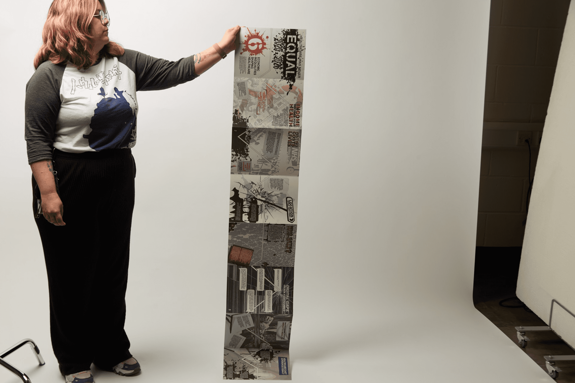
Major Project- 6 Economic Inequalities in Healthcare access 2020/2026
The name of this project is The History of Political Street-Art & Critique of Government's Actions and it's about the importance of Street art and its culture. It makes an analysis on how artists communicate their thoughts and political issues that inform the society.
This concertina design can be used in awareness campaigns, exhibitions, or educational settings to communicate the six main economic inequalities in healthcare in the UK between 2020 and 2026. Using elements of street culture and protest art, the design draws attention while conveying important information.

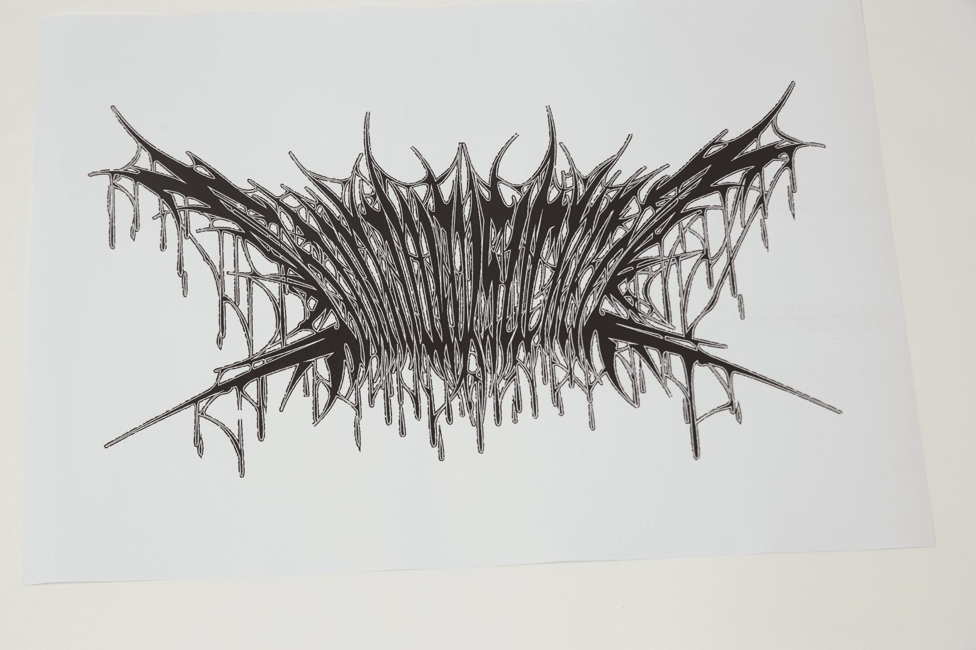

Professional Practice - Independent Design Practice - Ru n Away Sucker (Street art x Black metal Brand logo)
This project was made for a streetwear clothing brand named Run Away Sucker. The project was about creating a new logo design that is going to be made especially for the new drop that the brand was about to do. The theme of this new project is the gothic/black metal art style, combined with the street style culture.
The logo design communicate a chaotic, raw and aggressive style which is combined with urban style elements. It is not just dark, but a mix of hostile, raw, chaotic, violent and ominous aesthetics which give personality to the design.
Editorial Design
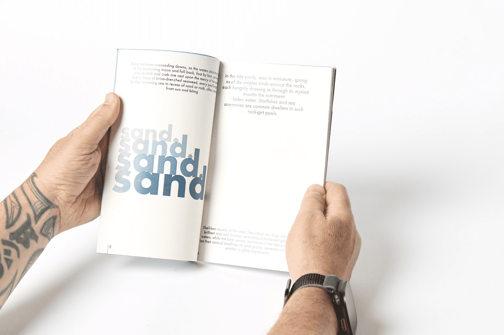
(Undersea Book)
This project focused on typography and its role as a tool to convey the central theme of the book, which explores the undersea.
This project deepened my understanding of how typography can convey meaning and reinforce a specific theme. It was also tool in developing my practical skills, as I learned how to design and print a book from start to finish.



ISTD - Power as Resistance (Samizdat series of 3 posters)
This project explores power as resistance through the use of typography by
examining Soviet Samizdat, where restricted language became resistant
through reproduction and circulation.
Typography is treated and used as material of evidence shaped by governments censorship, revealing resistance through repetition,disgrace and limitations. These three posters visualise how collective
voices remain strong within systems of control.
The first poster sets the project’s institutional voice. The second shows how the message persists even when the material is damaged. The third expresses resistance and survival through typography, combining disruption, instability, and wear. Despite being imperfect, the work survives and circulates.
About me:
I am a 2025 BA (Hons) Graphic Design graduate, seeking postgraduate work as a Junior Graphic Designer. My purpose is to design and create in order to make a positive difference and meaningful impact.
With a passion and keen eye for brand identity, typography, layout, and both print and digital media, I am dedicated to producing intentional, purposeful, and ethical design work. Through my freelance experience, I have collaborated with a diverse range of clients, enhancing my interpersonal, client management, and communication skills.
These skills enable me to advise clients effectively, propose efficient solutions, and deliver conceptual work that aligns seamlessly with their vision.
Thank you for your attention! Want to see more of my work?
If you want to see more of my work and understand my passion about designing, please don't hesitate to reach out!